Figure 1: Data exploration can be divided into data preprocessing and data visualization. For data preprocessing, we focus on four methods: univariate analysis, missing value treatment, outlier treatment, and collinearity treatment. For data visualization, we discuss dimensionality reduction methods including PCA, T-SNE, and UMAP.
Introduction
Data exploration, also known as exploratory data analysis (EDA), is a process where users look at and understand their data with statistical and visualization methods. This step helps identifying patterns and problems in the dataset, as well as deciding which model or algorithm to use in subsequent steps.
 Figure 2: Bad data will lead to bad results even with a perfect model
Although sometimes researchers tend to spend more time on model architecture design and parameter tuning, the importance of data exploration should not be ignored. For example, imagine you have developed a perfect model. However, if your data breaks the assumption of your model or your data contains errors, you will not be able to get the desired results from your perfect model. Without data exploration, you may even spend most of your time checking your model without realizing the problem in the dataset.
 Figure 3: The number of male employees is more than that of female employees at large tech companies including Amazon. The biased dataset led to a biased Amazon resume screening model favoring male applicants.
Source: (Dastin, 2018) Here is an example where your model can deliver unexpected results if the dataset is not carefully examined. Amazon once created an AI hiring tool to screen resumes (Dastin, 2018). They used the past 10 years of Amazon applicants’ resumes to train the model. However, the recommendation of the model biased heavily towards men and even penalized resumes that included words related to “women”, such as “women’s chess club captain”. The reason for such bias is due to the unbalanced number of male and female applicants in the past 10 years, as shown in Figure 3. In fact, if the data exploration step was properly performed, it would be easy to uncover such imbalance by looking at the distribution of genders.
In this blog post, we introduce a protocol for data exploration along with several methods that may be useful in this process, including statistical and visualization methods. We discuss the idea of each method and how they can help us understand the data. Then we present some additional examples regarding traps in data exploration and how data exploration helps reduce bias in the dataset.
Methods of data exploration
The protocol of data exploration
Before we discuss methods for data exploration, we present a statistical protocol that consists of steps that should precede any application. Although violations in some of these steps may have little impact on the results, most will increase type I or type II errors. Below we summarize the seven important points in the protocol, proposed by Zuur 2010.
- Outliers in the data:
Outliers, i.e. observations that have relatively large or small value compared to the majority of observations, may have a large or dominating impact on experiment results. Although techniques to deal with them may vary, it is important to know whether they exist. Boxplot and Cleveland dot plots are tools for outlier detection. - Homogeneity in variance:
Homogeneity in variance is an important assumption in analysis of variance, regression-related models and in multivariate techniques. It means the variance of the feature variables needs to be similar. This can be validated by exploring the residuals of the model; i.e. by plotting residuals vs. fitted values, and the variation of the residuals should be similar in the plots. - Normally distributed data:
Various statistical techniques assume normality, such as linear regressions and t-tests. Histograms can be used to show data distributions. - Zeros (missing value) in the data:
Zero (or null) data will make the analysis more complicated. They might be labeled incorrectly as similar since they are all zeros. - Collinearity in covariates:
If collinearity is ignored, one is likely to end up with a confusing statistical analysis in which nothing is significant. However, when one covariate is dropped, the others might become significant. Ways to detect collinearity include calculating variance inflation factors (VIF), pairwise scatter-plots comparing covariates, correlation coefficients or a PCA biplot applied on all covariates. - Interaction between variables:
Interaction means the relationship of variables will change according to the value of other variables. This type of information can be found by observing the weights of the variables when performing linear regression. - Independence in the dataset:
Data points in a dataset should be drawn independently. This can be analyzed by modeling any spatial or temporal relationships, or by nesting data in a hierarchical structure.
These points provide guidelines for data exploration. They motivate us to dive into some common techniques that are easy to perform but address important aspects in the above protocol.
Statistical methods
Univariate analysis
Univariate analysis looks at the pattern of each individual feature in the data and can be useful when we check outliers and homogeneity of variance (Point 1 and 2). More importantly, univariate analysis can be performed with little effort but it can provide a general sense of the data distribution.
For continuous variables, the univariate analysis consists of common statistics of the distribution, such as the mean, variance, minimum, maximum, median, mode and so on. For categorical variables, we usually use frequency tables, pie charts and bar charts to understand patterns for each category. Here is an example where we apply univariate analysis on housing occupancy.
 Figure 4: Univariate analysis of housing occupancy. We can use the frequency table to calculate the quantity and proportion of each item, and then use the pie chart and the bar chart to visualize it.
Source: (Saed, 2019) Outliers Treatment
An outlier is an observation that is far from the main distribution of the data (Point 1). It can either be an error in the dataset or a natural outlier which reflects the true variation of the dataset.
Outliers can greatly affect the summary indicators and make them not representative of the main distribution of the data.
 Figure 5: The influence of the outlier. The right part displays a list of numbers with an outlier. The mean and standard deviation are greatly affected by the outlier.
Source: (Sunil, 2016) For example, from the above chart, we can see that with an outlier, the mean and standard deviation are greatly affected. We need to be vigilant about outliers.
Some common ways to treat outliers are presented below (Sunil, 2016):
- Deletion: we can delete the outlier if it is because of some errors in the data collection process.
- Transformation: we can use natural log, binning and other variable transformation methods to reduce the difference between outliers and other variables.
- Imputation: if the outliers are artificial, instead of natural, we can use some statistical models to predict the values of outlier observation.
- Separate treatment: if the number of outliers is large, and we cannot delete them, we should treat them separately.
Missing value Treatment
Missing values may occur at two stages, data extraction and data collection (Point 4). If we don’t treat these missing values properly, they may reduce the performance of a model or lead to a biased model.
 Figure 6: The influence of missing values. The left part is a dataset with missing values, and females and males show the same interests. However, from the right part without missing values, female shows stronger interests.
Source: (Sunil, 2016)
The tables above show some basic information about people and whether they like to play cricket. While there are some missing values in the left table, the missing values are imputed in the right table. From the left table, we can conclude that the chance of playing cricket by males is the same as females. However, from the right table, females have a higher chance of playing cricket compared to males.
There are three common methods to treat missing values: deletion, imputation and prediction. Deletion means deleting the data associated with missing values. We usually use the deletion method when the missing parts are completely at random. When there are known relationships between samples, we can fill in the missing values with imputation or train a prediction model to predict the missing values. Some common models are regression and ANOVA (Sunil, 2016).
Collinearity
Another aspect of data exploration (Point 5) is to decide if there exist highly correlated features in the data (Zuur, 2010).
Although it might not reduce the prediction performance of the model, collinearity may affect the estimated coefficients. This will undermine our understanding of feature significance since the coefficients can swing wildly based on the others.
Below are some warning signs of collinearity in features:
- A regression coefficient is not significant even though, theoretically, that variable should be highly correlated with target value Y.
- When you add or delete another variable X, the regression coefficients of other variables change drastically.
- You see a negative (positive) regression coefficient when your response should increase (decrease) along with X.
To detect collinearity in features, bi-variate correlation coefficient and variation inflation factor are the two main methods. Bi-variate correlation coefficient is more useful when we are interested in the collinearity between two variables and variance inflation factor is more useful when we are interested in the collinearity between multiple variables.
Data visualization
While statistical data exploration methods have specific questions and objectives, data visualization does not necessarily have a specific question. It can just be performed to explore data and get a sense of what the shape of the data is. However, there is a complementarity between visualization and statistical methods for effective exploratory data analysis. From the visualization perspective, you can first get a sense of outliers, patterns, and other useful information, and then statistical analysis can be engaged to clean and refine the data.
Then what is data visualization?
Data visualization is a graphical representation of data. It uses visualization tools such as graphs and charts to allow for an easy understanding of complex structures and relationships within the data. Making data more understandable will benefit every professional field. By effectively using the ability of our eyes to quickly identify different colors, shapes, and patterns, data visualization enables easier interpretation of data and better data exploration.
However, it is very tricky to visualize high dimensional data. Common examples of high dimensional data are natural images, speech, and videos. Dimensionality reduction techniques are used to visualize and process these high dimensional inputs. There are many approaches to effectively reduce high dimensional data while preserving much of the information in the data. In this blog, we will focus on the three most widely used methods: PCA, t-SNE, and UMAP.
PCA
PCA is a dimensionality reduction method that geometrically projects high dimensions onto lower dimensions called principal components (PCs), with the goal of finding the best summary of the data using a limited number of principal components. The procedure for finding principal components is:
- The first PC is chosen to minimize the reconstruction error between the data, which is the same as maximizing the variance of the projected data.
- The next PCs are chosen in the same way, with the additional requirement that they must be linearly uncorrelated with (orthogonal to) all previous PCs.
A very useful example of PCA with great visualization can be found in this blog written by Victor Powell. There, you can also play around with PCA with a higher dimensional (3D) example. But for now, let’s focus on a dataset with only two dimensions.
 Figure 7: Original 2D data plotted in 2D x-y plane (Left). Projected data onto 2 principal components using PCA (Right)
Source: (Powell, 2015)
We plot the data in two dimensions, x and y, as points in a plane. PCA finds PCs based on the variance of those points, and transforms those points in a new coordinate system.
 Figure 8: Original 2D data plotted in each dimension (Left). Projection of the data in each principal component (Right).
Source: (Powell, 2015)
Now, we can see that the first PC (pc1) maintains the most variation, whereas pc2 has little variation. So even if we drop pc2, we don’t lose much information.
t-SNE
t-SNE is another dimensionality reduction algorithm and can be useful for visualizing high dimensional data (Maaten, et al., 2008). Unlike PCA, t-SNE is a non-linear method. The basic idea of t-SNE is as follows:
- Model probability distribution Pij (assumed to be Gaussian) on the original data
- Model probability distribution Qij on the projected data
- Find projected vectors by minimizing KL(P||Q) with gradient descent
Since t-SNE is a non-linear method, it introduces additional complexity beyond PCA. For example, t-SNE applies different transformations in different regions and has a tunable hyperparameter, called perplexity, which can drastically impact the results. Below we show some examples with simple datasets to demonstrate the importance of perplexity in t-SNE (Wattenberg, et al., 2016).
Perplexity
As a hyperparameter of t-SNE, perplexity can drastically impact the results. The intuition behind perplexity is that, as the perplexity increases, the algorithm will consider the impact of more surrounding points for each sample in the original dataset.
 Figure 9: The value of perplexity can impact t-SNE result.
Source: (Maaten, et al., 2008)
The above example shows how perplexity can impact t-SNE results. The original dataset contains two clusters in 2D with an equal number of points. As we can see, when the perplexity is too small or too large, the algorithm cannot give us meaningful results. Recommended values of perplexity are between 5 and 50 (Maaten, 2008).
Cluster size
 Figure 10: The variance of clusters in the original dataset may not be maintained in t-SNE.
Source: (Maaten, et al., 2008)
The variance of clusters in the original dataset is not respected in t-SNE. In the above example, the two clusters have different variance. However, we can see that for most choices of perplexity, the projected clusters seem to have the same variance. Therefore, we should not trust t-SNE in providing us the variance of original clusters.
Topology
 Figure 11: Constructing multiple views of high dimensional data in the lower dimension helps us understand the data topology.
Source: (Maaten, et al., 2008)
We often want to project high dimensional data to lower dimensions with t-SNE. In order to fully understand the topology in a high dimension, we often need to construct multiple views in the lower dimension. As shown in the above example, some views inform of the shape of the data, while other views tell us the two circles are linked instead of being separated.
Nondeterministic results
 Figure 12: t-SNE can have different results under the same parameter setting.
Source: (Maaten, et al., 2008)
t-SNE employs gradient descent to minimize the KL divergence of two distributions. Since this is a non-convex optimization problem, we may encounter different results during each run even under the same parameter setting.
UMAP
Uniform Manifold Approximation and Projection (UMAP) is another nonlinear dimension reduction algorithm that was recently developed. The algorithm originates from topological data analysis and manifold learning. At a very high level, UMAP is very similar to t-SNE, but the main difference is in the way they calculate the similarities between data in the original space and the embedding space. For a relatively conceptual description, you can take a look at Conceptual UMAP. For a more mathematical description, we refer you to Math UMAP.
Here, we focus on the practical usage of UMAP. The following code block in Python shows an example of using it:
import umap

fit = umap.UMAP(
    n_neighbors=15,
    min_dist=0.1,
    n_components=2,
    metrics='euclidean'
)

# data is NxM where M is the dimension
trans = fit.fit(data)

# data_embedded is Nxn_components
data_embedded = trans.transform(data)
We define the UMAP object and set the four major hyperparameters, n_neighbors, min_dist, n_components and metrics. Then, we fit the data with the UMAP object and project it to 2D. The code for using UMAP is straightforward, but the choice of hyperparameters can be as confusing as that in t-SNE. The n_components is the dimension that we want to reduce the data to, and metrics determine how we are going to measure the distance in the ambient space of the input. Those two hyperparameters are basically fixed when the problem is defined. However, n_neighbors and min_dist need to be tuned in a case by case fashion, and they have a significant impact on the output.
To demonstrate the importance of these hyperparameters, we follow the example from the UMAP website with a random color dataset. The dataset is generated as follows:
data = np.random.rand(800, 4)
There are 800 data points and each of them has 4 dimensions, corresponding to R, G, B and a, where a is the transparency.
n_neighbors
The n_neighbors determines the size of the local neighborhood that it will look at to learn the structure of the data. When it is large, the algorithm will focus more on learning the global structure, whereas when it is small, the algorithm will focus more on learning the local structure.
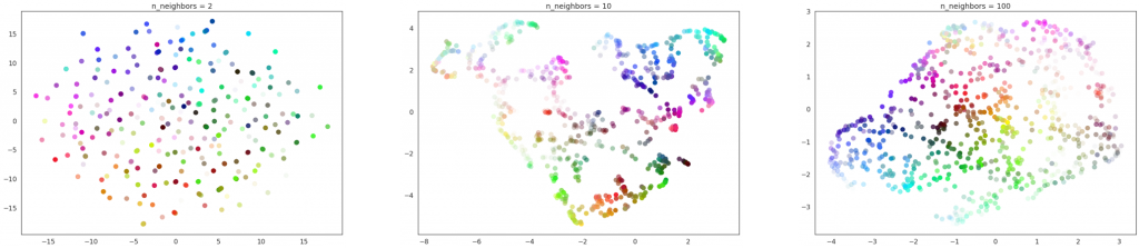 Figure 13: From left to right: n_neighbors = 2, 10, and 100. For all cases, min_dist = 0.1.
Source: UMAP website
Using the color dataset, we can see that when n-neighbors is too small, UMAP fails to cluster the data points and when n_neighbors is too large, the local structure of the data will be lost through the UMAP transformation. Therefore, the n_neighbors should be chosen according to the goal of the visualization.
min_dist
The min_dist decides how close the data points can be packed together.
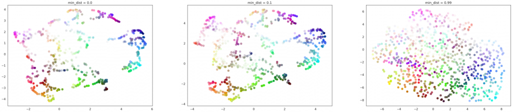 Figure 14: From left to right: min_dist = 0.0, 0.1 and 0.99. For all cases, n_neighbors = 15.
Source: UMAP website
When min_dist is small, the local structure can be well seen, but the data are clumped together and it is hard to see how much data is in each region. When min_dist is large, the local structure will be lost, but since the data are more spread out, the amount of data in each region could be seen. Therefore, if the isolation of data is necessary, choosing a smaller min_dist might be better. If knowing the amount of data in each region is important, a larger min_dist may be more useful.
Discussion
We have shown the techniques of data preprocessing and visualization. Here we would like to discuss some traps in data exploration and demonstrate their importance with more detailed examples.
Traps in data exploration
If data exploration is not correctly done, the conclusions drawn from it can be very deceiving. We show the following two examples from the book How to Lie with Statistics by Darrell Huff.
One example is related to the correct choice of the mean. Suppose that last year, the price of milk was 20 dollars and the price of bread was 5 dollars, while this year, the price of milk is 10 dollars and the price of bread is 10 dollars. This is also shown in Table 1. The question is: did the cost of living go up? If you are not careful about the choice of mean, you might end up in the following scenario.
Suppose we use last year as the base price, then the price of milk is 50% of the original and the price of bread is 200% of the original. The arithmetic mean is (200%+50%)/2=125%. Therefore, we might conclude that the cost of living increases from last year. However, if you use this year as the base price, then the price of milk from last year was 200% percent of that of this year and the price of bread was 50% of that of this year. Then (200%+50%)/2=125% and we might conclude that the cost of living was higher last year.
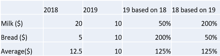 Table 1: Prices of milk and bread in two years and their percentages based on the other year.
This example indicates that if we are not careful about choosing the correct summary indicator, it could lead us to the wrong conclusion. However, even if we have chosen the correct summary indicator, we could still be drawn to the wrong conclusion due to the loss of information in the summarizing process.
For example, the Oklahoma City government claims that for the last sixty years, the average temperature was 60.2 F. Just looking at this number, we might conclude that the temperature in Oklahoma City is cool and comfortable. However, in this summary, we miss a lot of information, which can be better seen if we plot the data. From the graph, we can see that there is a 130F range of temperature and the truth is that Oklahoma City can be very cold and very hot.
 Figure 15: Temperature in Oklahoma City has an average of 60.2F but a range of 130F.
Source: (Huff, 1954)
Data exploration to reduce biases
Another important aspect of why data exploration is important is about bias. When bias is significant in datasets or features, our models tend to misbehave. Biases can often be the answer to questions like “is the model doing the right thing?”, or “why is the model behavior so odd on this particular data point?”.
By performing data exploration, we can better understand the current bias in our datasets. Although not necessarily reducing or fixing the bias right away, it will help us understand the possible risks or trends the model will create. We will illustrate this with an example.
Is this a wolf, or something else?
Let’s say you trained an image classification model, that can identify animals inside a picture, say dogs or wolves. Using common techniques with models trained on massive datasets, you can easily achieve high accuracy. For the images that contain obvious animals, the model predicts perfectly with high confidence (first three images from left to right in Figure 16). However, if the researchers replace the wolves from the image with grey area, the model surprisingly still classifies the image as containing a wolf (Ribeiro, 2016).

Figure 16: The classification model can do well in most images on classifying dogs and wolves, but misclassified a snow picture as a wolf.
Source: (Ribeiro, 2016)
It turns out the model learned to associate the label “wolf” with the presence of snow because they frequently appeared together in the training data! The wolves images in the training dataset are heavily biased to snowy backgrounds, which caused to model to produce strange results.
The problem may be difficult to catch by looking at accuracy metrics, but it may be detected through data exploration, such as examining the differences between the dog and wolf images and comparing their backgrounds.
Summary
Data exploration is a process to analyze data to understand and summarize its main characteristics using statistical and visualization methods. During this process, we dig into data to see what story the data have, what we can do to enrich the data, and how we can link everything together to find a solution to a research question.
We first looked at several statistical approaches to show how to detect and treat undesired elements or relationships in the dataset with small examples. We then introduced different methods to visualize high dimensional datasets with a step by step guide, followed by a comparison of different visualization algorithms. Furthermore, we discussed cases that show an analysis could be deceiving and misleading when data exploration is not correctly done. Finally, we demonstrated the ability of data exploration to understand and possibly reduce biases in the dataset that could influence model predictions.
Designing model architectures and optimizing hyperparameters is undeniably important. However, we argue that scrutinizing the dataset is another important step that should not be overlooked.
References
Dastin, Jeffrey. (2018). Amazon scraps secret AI recruiting tool that showed bias against women [Blog post]. Retrieved from https://www.reuters.com/article/us-amazon-com-jobs-automation-insight/amazon-scraps-secret-ai-recruiting-tool-that-showed-bias-against-women-idUSKCN1MK08G
Maaten, L. V. D., & Hinton, G. (2008). Visualizing data using t-SNE. Journal of machine learning research, 9(Nov), 2579-2605.
Wattenberg, M., Viégas, F., & Johnson, I. (2016). How to Use t-SNE Effectively [Blog post]. Retrieved from https://distill.pub/2016/misread-tsne/#citation
Huff, D. (1954). How to Lie with Statistics. W. W. Norton & Company.
Zuur, A. F., Ieno, E. N., & Elphick, C. S. (2010). A protocol for data exploration to avoid common statistical problems. Methods in ecology and evolution, 1(1), 3-14.
Ribeiro, M. T., Singh, S., & Guestrin, C. (2016). Why should i trust you?: Explaining the predictions of any classifier. In Proceedings of the 22nd ACM SIGKDD international conference on knowledge discovery and data mining (pp. 1135-1144). ACM.
Powell,Victor, Lehe, Lewis. (2015). “Principal Component Analysis explained visually.” Retrieved from http://setosa.io/ev/principal-component-analysis/
McInnes, L, Healy, J, UMAP: Uniform Manifold Approximation and Projection for Dimension Reduction, ArXiv e-prints 1802.03426, 2018
Dr. Saed Sayad. (2019). An Introduction to Data Science. [Blog post]. Retrieved from https://www.saedsayad.com/data_mining_map.htm
Sunil Ray. (2016). A Comprehensive Guide to Data Exploration. [Blog post]. Retrieved from https://medium.com/analytics-vidhya/a-comprehensive-guide-to-data-exploration-d5919167bf6e